Request a quote
CLOSE
Contact details
Services
Project details
Complete
Let’s start the conversation.

We’re glad you found Array and choose to get in touch. So enough about us, what about you?

It’s great to meet you!

What can we do for you? Pick one – or any combination – of our awesome services below.

Sounds great – tell us more!

Let us know some of the finer details of your project.

Ready to wrap up?

I think we have all we need right now to get the ball rolling here. Just one more thing…

Back to Portfolio
Tourism Coquitlam
A fun new brand and website for an outside-the-box community experience.
Location
Coquitlam, BC

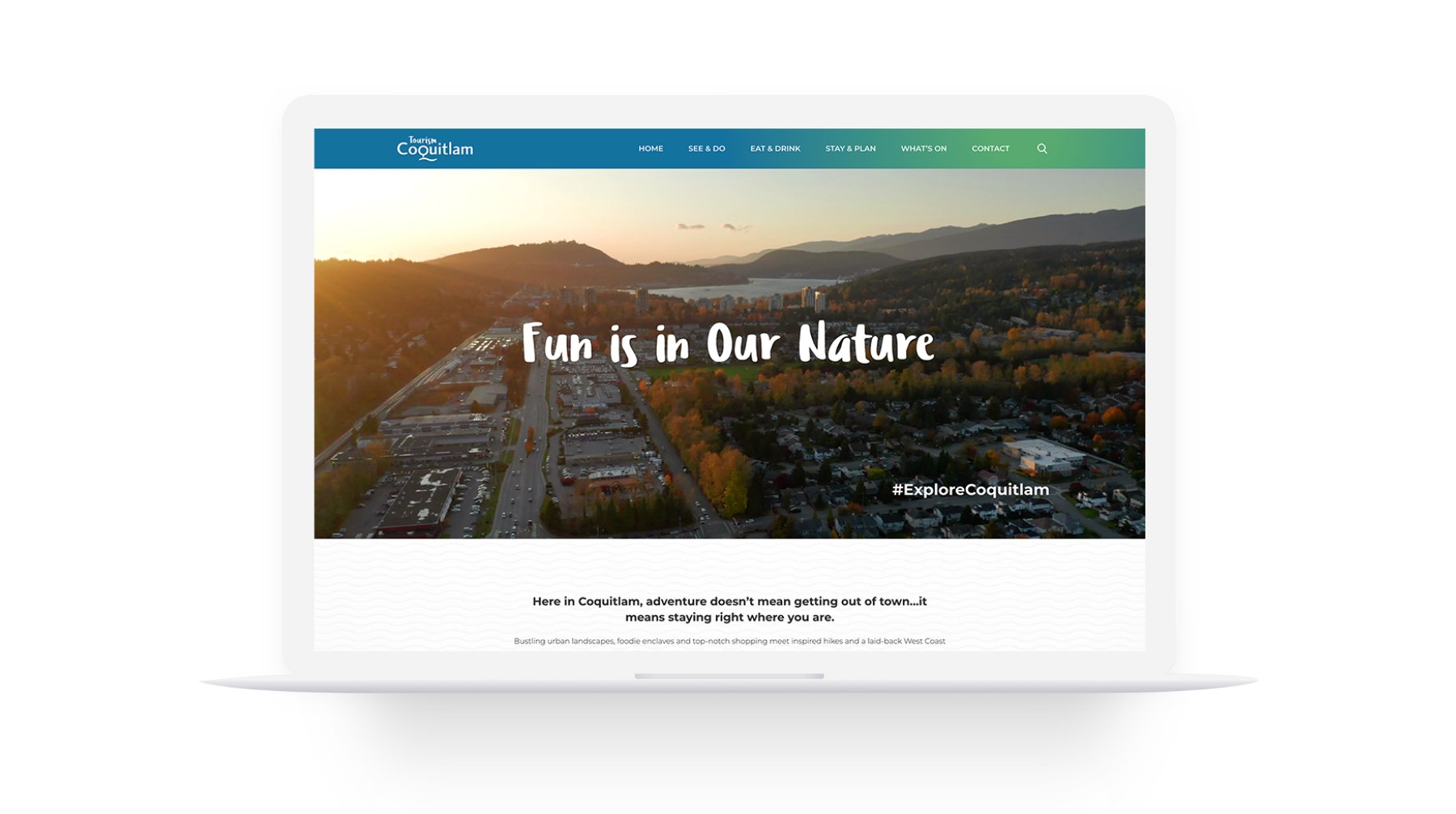
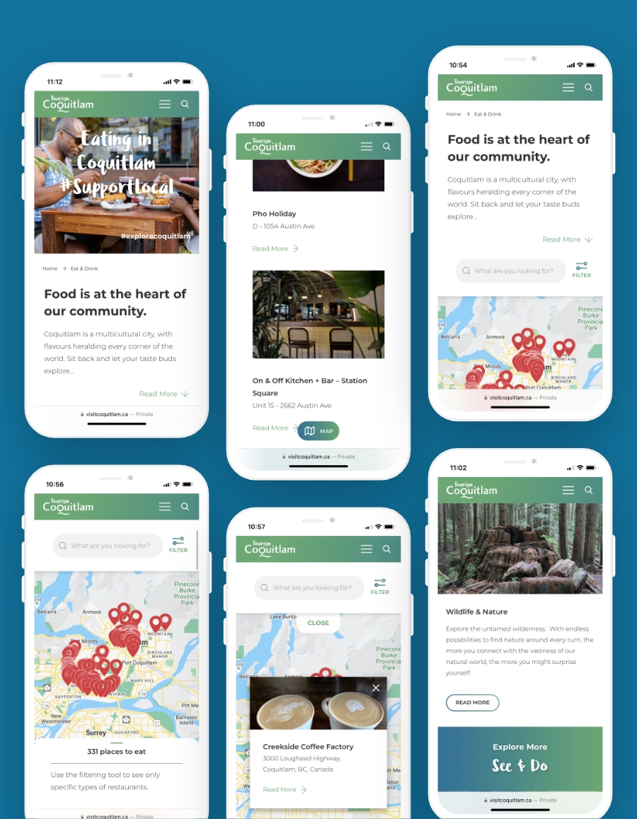
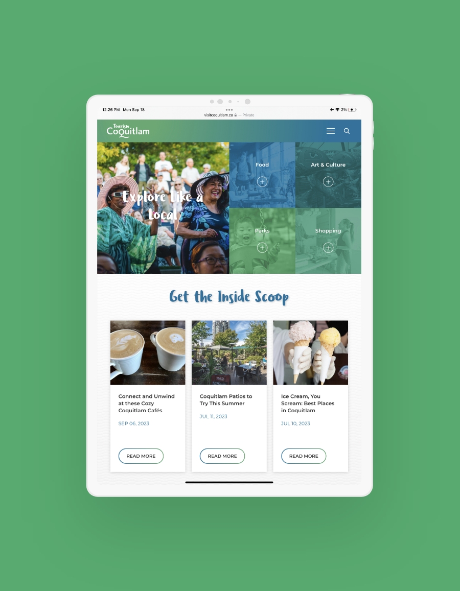
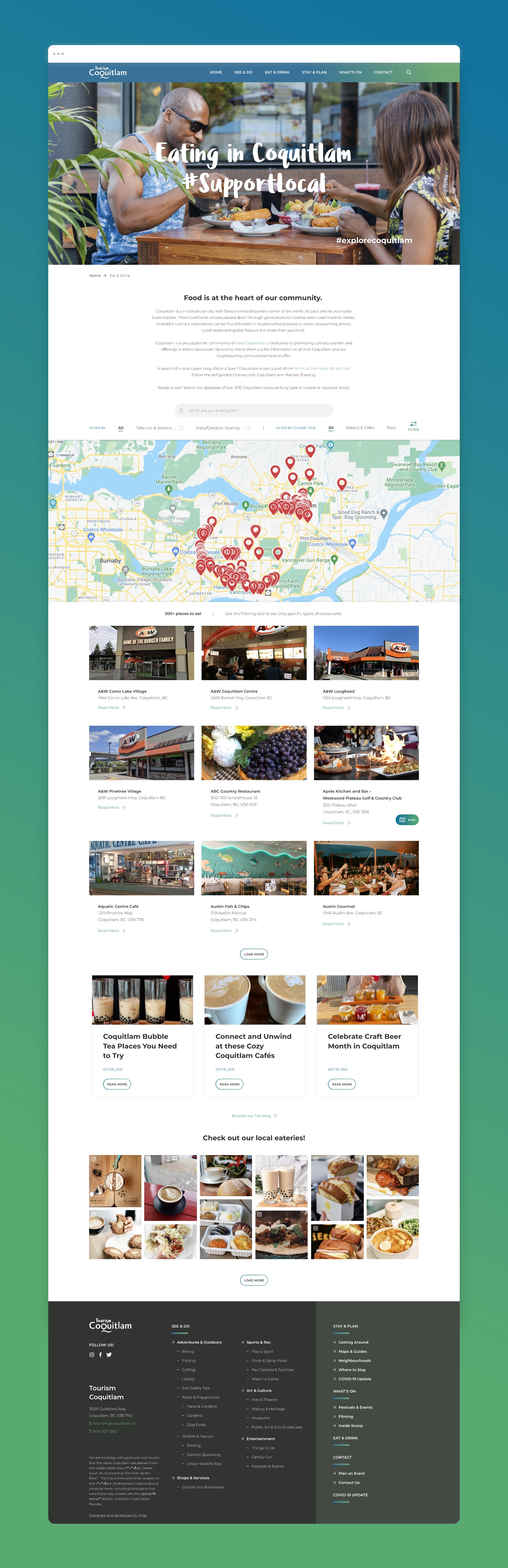
With a new Tourism department, the City of Coquitlam required a modern website to welcome visitors and showcase all the great local events, entertainment, recreation and more that is available in and around the area. They were in need of complementary brand development that included an inviting logo and professional business cards for tourism staff.

What did we do?
Business Card Design
Tagline & Slogan Development
Website Design & Programming
How Did We Help Them Out?
  • The thick rounded lines of the logo typography give a friendly, inviting, and approachable feel. The flowing and interconnected typography speak to adventure, nature, and authenticity. Together, these elements convey a sense of fun that pushes Coquitlam out of the stereotype of being a “Bedroom Community” and showcases possibility. The even letter forms/height across the logo minimizes the feeling of being busy or too hard to read. By extending the “T” across, we create a cohesive group with a linear shape. This creates a strong focal point making it visually more impactful and easier to read.
  • The tagline communicates that when you visit Coquitlam there’s always something to experience, enjoy, and explore. Array also worked with the city to develop their hashtag campaign.
  • Easy-to-navigate website architecture offers visitors clear dynamic information about current and upcoming things to see and do, eat and drink, and stay and plan. The bright colours of seafoam blue and spring green were chosen to highlight creativity and confidence while communicating safety and calm. Feature cards for events and activities offer a strong visual appeal, while special functionality allows for interactive and collaborative event calendars with a submittable event form to post listings online.
  • Our web design and web development teams created an interactive map for the Eat & Drink and Shopping Pages. The maps feature custom features that allow end-users to filter by cuisine type, patios, locations, etc. Each business listing is programmed as a post type and features contact information, hours, and address that are manageable in the CMS.
  • Online advertisements were also developed with the new brand to incorporate the colours, fonts, taglines and look and feel of the website. Business cards were then created to provide further consistency and professionalism to the Tourism department’s ongoing marketing efforts.
Learn How Our Projects Come To Life